
Colors of 2022: A Tale of Silver-Greens & an Unexpected Pop of Purple
As interior design enthusiasts, we look forward to early December when Pantone and renowned paint brands reveal their “colors of the year” for the upcoming 12 months. The newly released colors for 2022 do not disappoint and have given us plenty to buzz about. With elements of consistency and surprise, this batch of tones are ripe for discussion, and we can’t wait to hear your thoughts! Please let us know if you love these, hate them, or are left somewhere in between.

“The Color of 2022” as determined by paint companies
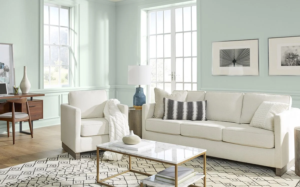
The colors selected by each paint brand for 2022 are amazingly similar, which is not the case every year. Evergreen Fog (Sherwin Williams), Breezeway (Behr), and October Mist (Benjamin Moore) all look like close relatives from the same family tree.
Inspired by the unique state of desiring peace and also craving adventure that many of us during the Covid-19 pandemic, these colors are meant to evoke feelings of calmness while making space for creativity. Behr describes Breezeway as “a relaxing and uplifting sea glass green expressing peace and tranquility for forward movement” - similar descriptions can be assigned to all three.
While the warmth varies, there is a consistent prediction that these silver-green colors will become prevalent throughout our world, especially in the real estate and design space, during the upcoming year. Sherwin Williams also notes that they expect colors to continue trending toward supporting physical and emotional wellbeing in the coming years, a notion that ties in with the popularity of biophilic design. (Read more about biophilic design in our blog post on Summer 2020 Design Trends)
When it comes to home design, these greenish neutrals will make for a lovely canvas to anchor a room, while giving you space to add complementary colors and patterns to craft the unique look that suits your taste.


“The Color of 2022” as determined by Pantone
Now comes the surprise that we mentioned! For the first time in the history of the Pantone Color of the Year program, the brand created a new color and named it the Color of 2022. Pantone says that the introduction of “Very Peri,” this fresh and groundbreaking violet-blue hue, “reflects the global innovation and transformation taking place."
Also rooted in the communal feelings we share as a result of the global pandemic, Pantone has a different take than that of the paint brands. Rather than nodding to our human desire for tranquility, Pantone is capturing our need for newness and a fresh start.
Color experts are noting that this unique shade of periwinkle is one of the happiest colors that Pantone has awarded the title Color of the Year, and that it evokes a sense of fantasy, possibility, and love.
When it comes to incorporating Very Peri into interior design, we expect this bold color will come through more often in accent pieces than in wall paint or furniture. Throw pillows, clocks, blankets, flowers, curtains, and kitchenware could be fun areas for experimenting with this happy hue.

